

Getting Started
Experience print possibilities in the real world.
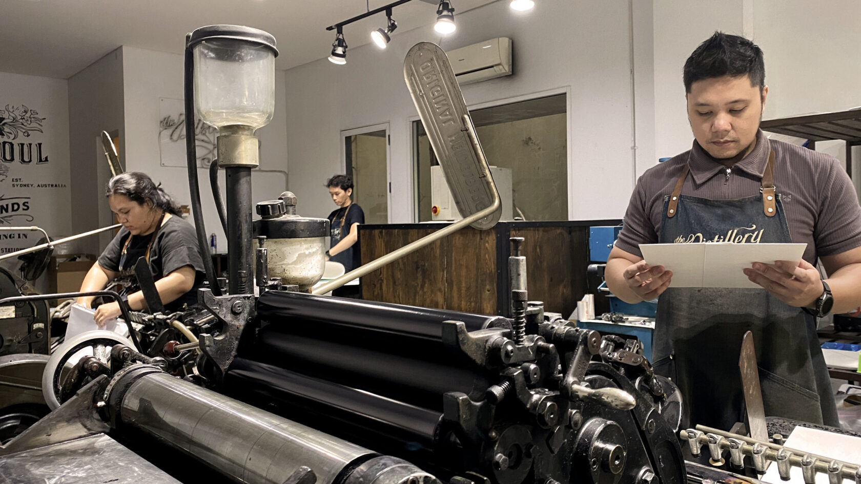
You’re invited to visit The Distillery in Kemang where we’d love to share:
- Paper stock library and samples
- Pantone ink swatches and colour tests
- Print techniques
- Prototype your artwork
- Hold and review samples from The Distillery’s print library
Feel free to bring your end-client too, and we’ll help you share the benefits of well considered design.
Browse the Project Gallery, or Book a Consultation.
Here are some methods you can always rely on:
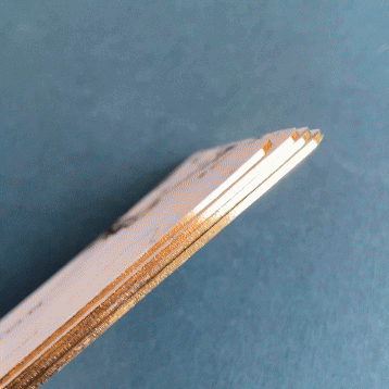
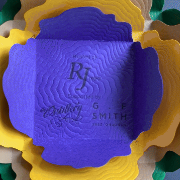
- Thick card stock – Substance holds strong
- Uncoated touch – Humans are drawn to nature. Select uncoated paper stocks. Avoid glossy, shiny and plastic texture.
- Avoid default shapes & sizes – Much like Calibri, standard card sizes and ‘trending’ gravestone arches invoke a generic outcome
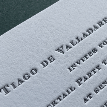
- Less is more – Black on white is often enough
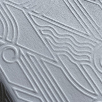
- Deboss is the boss – Subtle or deep letterpress impression offers a refined enhancement. Comic Sans even looks nice with it!
Taking it further
- Character – Introduce subtle character with an off-white or subtle textured card stock.
- Foil at volume ‘2’ – Consider limiting foil to selected titles. Black foil is also subtle and smart.
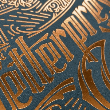
- Foil at coverage ’10’ + expression ‘1’ – For something different hit it with a large block of foil, delivered in a subtle pearlescent white or silver champagne gold =👌🏻.
The Distillery’s Project Service Centre offers resource to help you start and finish on the right foot.
Artwork & Format Guidance
- Artwork set up
- Card size guide
- Wording guide – wedding stationery
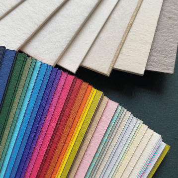
Creative Library
- Paper stock library
- Colorplan paper – CMYK values
- Pantone – CMYK conversion guide
- Foil swatch library
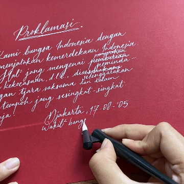
- Calligraphy style library